


Fall is finally here and families are starting to book their holiday sessions.
This is one of my favorite times to photograph. It’s a chance for families to come together to celebrate each other and being a family. I love seeing their joy and love as they take this opportunity to hug and enjoy each other.
This is also the time that I start to get the questions about what to wear for family portraits. While I believe this is a personal preference and don’t really like to dictate the look of a session, I can offer the following suggestions from experience about what I’ve seen that looks nice and has worked well for families:
Begin by thinking about what is the purpose of your portrait.
- To update walls?
- To announce an important life event?
- Holiday cards?
- To create gifts for extended family?
If the goal is to create art for your walls, think about how formal your home is, and match that style in your outfits. Naturally, people are most comfortable in comfortable clothes, but would that look right in a formal living room?
What colors do you love to decorate with? Earth-tones of brown, rust, gold, and cream? Bold pops of color on a neutral canvas? Soft and pale tones (pastels)? Neutral tones of black, white, gray, and cream?
Which colors make you feel happy?
- red, magenta, orange, yellow, yellow-green = energy, romance, and warmth
- turquoise, green, blue, purple = cool, calm, tranquility, peace
- black, gray, tan, brown, white = neutrals, foundation, classic
If your goal is for holiday cards, bright colors catch attention when they arrive in the mail, but avoid being simply the holiday red and green which may limit your opportunities to enjoy the images as year-round.
Here are a few simple tips:
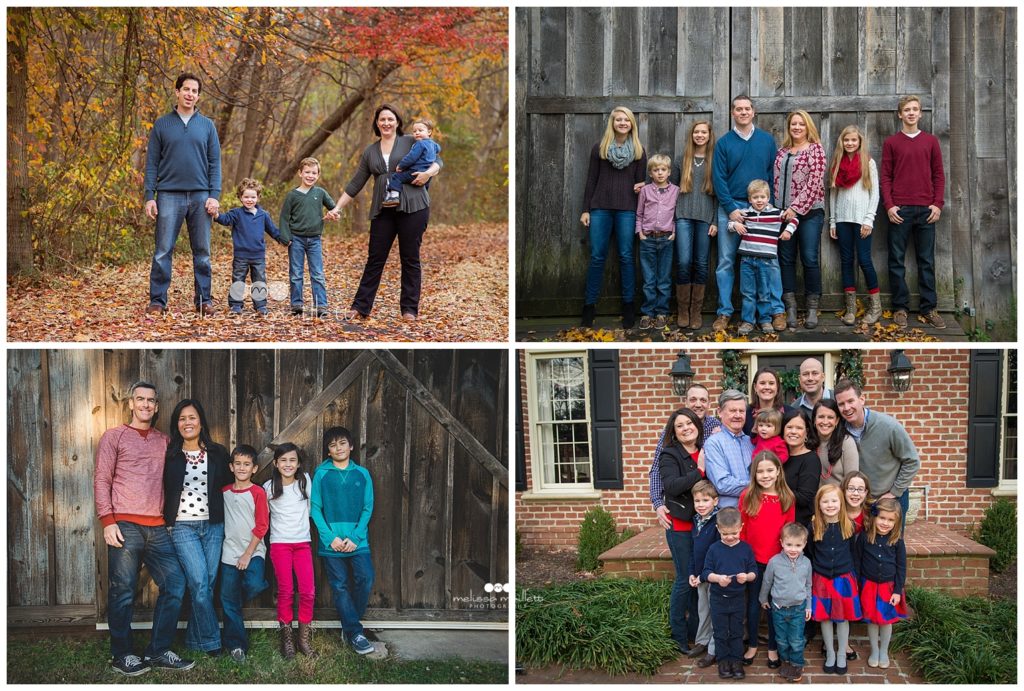
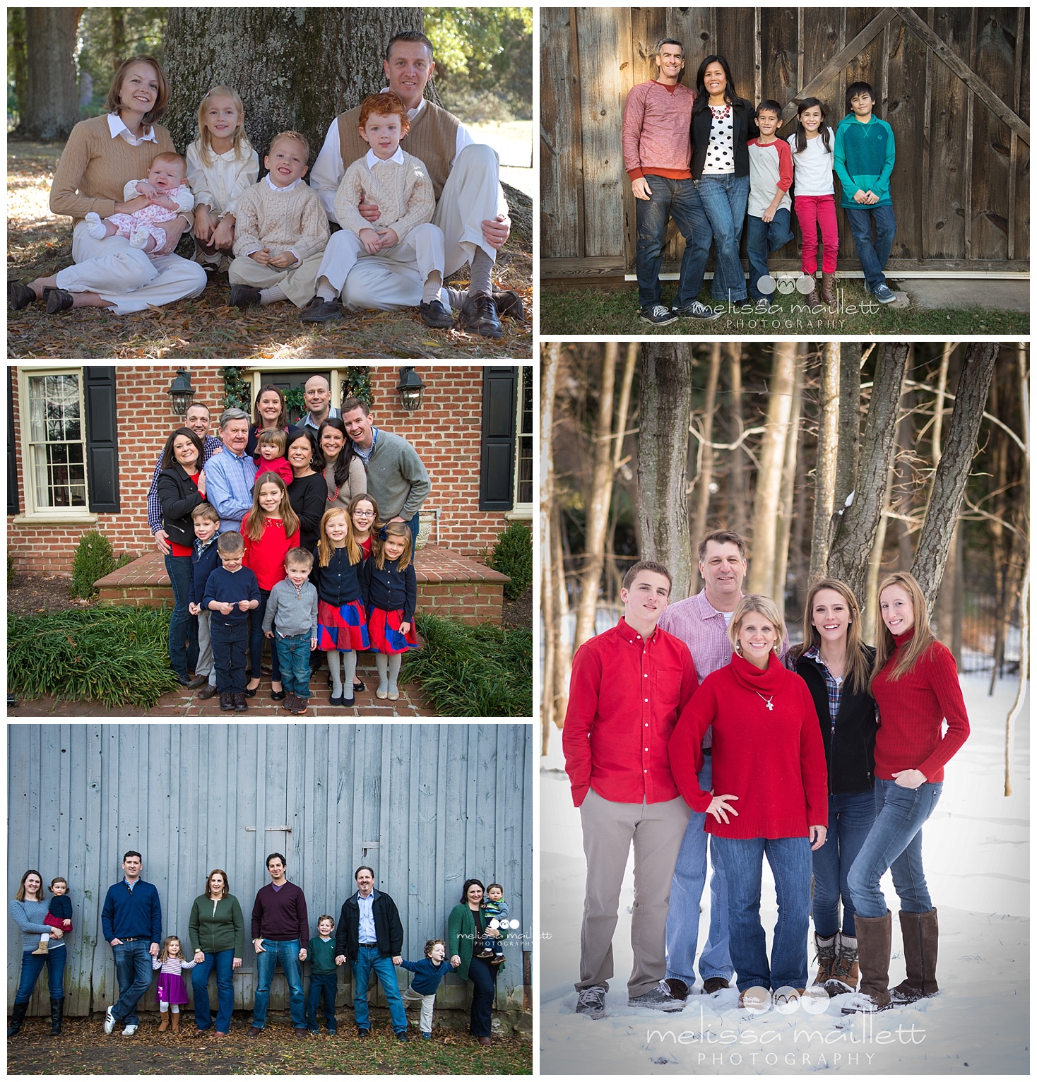
- Avoid being too “matchy, matchy.” It’s okay to look semi-coordinated but don’t all arrive to your session wearing identical blue polos unless that is how you want to remember each other. Your family portrait may depict a blue shirted monster with 5 heads if you all wear the same exact color.
- Keep your location in mind. If you are planning to photograph in peak foliage season season, deep reds, oranges and greens look great. You may want to save your pastels and icy blues for summer or more urban locations. Blacks and whites, although they make a nice statement, do not necessarily complement autumn colors, but if you are at a location with a lot of brick or stone could look great!
- Denim or not? Decide if this casual or semi casual look is what you’re after. If not, decide what will be worn for pants/ skirts/ etc. Too much denim an be overwhelming.
- Select a favorite color family. It is okay to have blue be your theme, but combine lights (tints) and darks (shades) with your main color to create variety and contrast.
- Textures photographs well! Choose a few items that will add texture: a scarf, vest, fun boots, jacket, a woven cardigan, etc. Layers are great. Rather than just a boy in a T-shirt, add a layer by wearing a button up shirt over the top. Belts, jewelry, watches all add to the “texture” element.
- Shop in your closet. Before you go out and buy an all new wardrobe, gather from your closets some samples of the colors you are considering and line them up on a bed or couch and see how they look together. When you blur your eyes do you see lights and darks? What pops out? Save money by using clothing you already own, with the addition perhaps a new piece or two. After you’ve done your line up, see what is lacking (ie. another dark shirt, a complementary color, etc.) If you want your portrait to be authentic- avoid buying clothes that you know your family would never wear “in real life.”
- It’s okay mix solids and simple patterns. I know a lot of photographers might argue with me on this one, but I like to think that SIMPLE patterns add interest and texture to a picture. Three of the men above have patterned, buttoned-down shirts, and it works just fine with the solid colors. If you stick to a color scheme, everything just naturally blends together.
- Think of the rule “Three Colors and a Pop” (credit to Orange County photographer Meghan Owens for this phrase). Pick three colors, with one being a neutral, and add a “pop” of color. It usually works best when it’s a bright color on one of your littlest family member (think red scarf or purple boots).
- Colorful Accessories. Similar to the above tip, colorful accessories photograph best for all family members. You want the focus to be on the faces more than the outfits. Similarly, a bright jacket or cardigan that can be put on or off works well!
- Watch the shoes. Even if they are your kids’ favorite shoes, character and light-up sneakers date a portrait. Even some of the “louder” sneakers can be distracting in a family portraits.
Think Timeless. Again, you want the focus on your faces, your emotions and your family. Not the outfits. Too styled a look can deter from the emotion that is displayed in the togetherness of your family.
So, that’s it! Hopefully, the above tips will help you do a little advance planning for your family sessions to create beautiful family portraits. For even more ideas and tips, check out my Pinterest Board Family Portrait Outfit Ideas.


+ view comments . . .